


Symbol
Bucheon City Brand
The integrated brand of Bucheon City centers around its name, the city’s most straightforward symbol. By combining the Korean alphabet “ㅂ” and the English alphabet “b” of Bucheon, Bucheon City makes an attempt to differentiate from other public brands. It embodies the essence of a sustainable city, reflecting the diversity, connectivity, and dynamism that define Bucheon. The “three-dimensional” image represents Bucheon’s “diversity,” where culture, industry, and life harmonize. The “face-to-face” image conveys the “connectivity” of Bucheon, infinitely linked to a new future. The “diagonal line” image signifies the city’s “dynamism,” characterized by diverse thoughts and activities from its citizens.

The Tree of the City: Peach Tree
Wild peach trees have been growing around Mt. Seongju in Bucheon since long ago. Improved peach trees were first cultivated in the 1990s. Thanks to optimal growth conditions such as gentle slopes for better drainage, an annual average temperature of 11~15℃, etc., the peach tree is the city’s representative agricultural product.To revive the old ambience and respect with which Sosa peach has been regarded, the city has changed its official tree from the ginkgo tree to the peach tree.
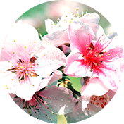
The Flower of the City: Peach Blossom
The official flower of Bucheon city is the peach blossom.From late April to early May when flowers come in full bloom, the city holds the Boksagol Arts Festival for the citizens to enjoy together.
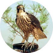
The Bird of the City: Young Hawk
Bucheon City has designated the brave young hawk its official bird in 1990.The young hawk represents progress toward a bright future for the city. It is our hope that Bucheon grows as swiftly and gloriously as the young hawk soars in the sky,
(14547) Giljuro 210(1156, Jungdong), Won Mi-gu, Bucheon City, gyeonggi-do Tel : 82-32-320-3000
Copyright(c) 2017 Bucheon city. ALL RIGHT RESERVED.